

Like our free content? Then you'll love our exclusive Club!
Divi Academy Membership gives you exclusive access to over 110 resources, including child themes, layouts, cheatsheets, tutorials, live training and member perks. And new content is added EVERY Monday!
Here is a another Quick snack for you, making the specialty section fullwidth. I love the specialty section and think it is really underused, it’s great for more complex layouts and can be used to create a really nice effect with multiple module types.
Before we start, I just want you to know how difficult it is for me being British to write Specialty rather than Speciality in this post! But seeing as Divi uses Specialty, I am reluctantly ignoring all those red zig-zag lines spell check is placing under the word 
Click here to check out the live demo.
So let’s get cooking!
Ingredients
The Divi Theme or Divi Builder Plugin from Elegant Themes
Images if you intend to use them.
Cooking time
This should take you around 5 minutes max.
Preparation
The first thing we need to do is create a new specialty section, I am using the first one of the nine options available.

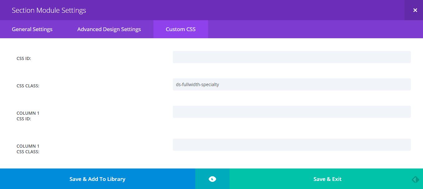
Now open up the Section Settings, click on the Custom CSS tab of your section and add in a Custom CSS Class, I’m using ds-fullwidth-specialty, then save & exit
Method
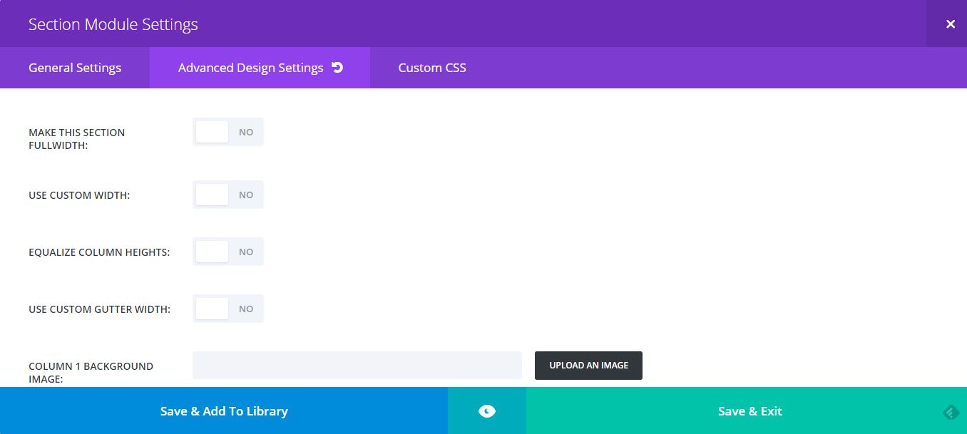
You will see in the specialty section advanced settings tab that there is an option to make the section fullwidth. However, this doesn’t work like it does on standard sections and your content will not reach to the edge of the screen as you would expect it to so there is no need to activate it, we are going to do that with CSS instead.
Copy and paste the code below into your Child Theme style.css or if you aren’t using a child theme (which you really should be) then paste into the Divi Theme Options epanel custom CSS section and don’t forget to save.
/*--------------Fullwith Specialty Section----------------------*/

.ds-fullwidth-specialty> .et_pb_row {
min-width: 100% !important;
}
Now you will need to add in the columns, rows and modules you want to use in your specialty section. I’m not going to go through each one as with nine layouts to choose from and 40+ modules there are too many variations to consider. but you get the idea Here is what mine looks like.

You will also need to play around with the padding values in the section, rows and modules to get it looking just how you want. Generally, I am using 5% padding in column 1 of the section with a little bit of padding to the right of each of the text modules.
And that’s it, easier than you thought it would be eh?.
If you found this helpful please leave a comment and subscribe to my newsletter for all my latest Divi related content. 
Michelle X





Hello, for some reason this isn’t working for me. Has anyone else had this issue? I tried pasting the code into the child theme css and into the section itself, but no luck. Does the section settings have to be set to default?
Thanks!
Be sure you are using the correct CSS class and placing it in the correct place per the recipe
Just wondering can we make normal section full screen like full-width header full screen
You can use the CSS rule vh:100; which sets the viewport to 100%. Place that in the main element of the section in the advanced tab.
can you write full CSS to make standard section to full-width section?
Fullwidth you can do in the row settings, for a full height section, add height: 100vh; in the main element field in the advanced tab
how do you add a title to a specialty section? A centred title? I have an image background and normally i’d add a new row but can’t make it go all the way across as the format I chose is 50-50 4 boxes (big one on left). Thanks
You can use CSS to extend the row, but without a link I cannot provide any code
I believe you can do this by simply going to the “Page Settings”, NOT the section or row, and setting the gutter to the lowest setting.
You should know that by doing this your center aligned images in a fullwidth row may become Left aligned. You can fix this by adding this to the Custom CSS of those Image modules that you need centered.
margin: auto !important;
The problem with that is that anything you apply there affects the whole page, which may not actually be wanted.
Michelle, I tried this, but it is not working for me. The first module, I thought I could make it work, but I am getting a white section to the right that I cannot figure out how to get rid of. So, I tried your suggestion below, but the second module is what I ended up getting following your instructions. I must be doing something wrong. Simply want a slider that is 3/4 and then a 1/4 opt in form with a background color and a bit of padding.
I would need to see a link to determine what is wrong, but if all you are wanting is 3/1 1/4 then you don’t need a speciality section, just use a standard section and set to fullwidth.
Wow! Fantastic! : D
You are a lifesaver! I was really struggling with this and could not figure out what it would take to make the so called fullscreen setting of speciality layout work as expected. Sooooo many trials and then a quick search got me here. Thank you for sharing.
You are welcome Amit
Thank you so much, you saved my day
Welcome Sophie
Hi Michelle! Works fine! I´ll use in my future projects.
Can u help me in another situation?
How can i put 2 images side by side in a fullwidth section, like this: http://alextalmon.nl/
Thank you!!!
Hi Michelle.
I find the solution in the end of this tutorial. http://www.elegantthemes.com/gallery/divi/documentation/rows/
Tks
Glad you got it sorted Thiago
It worked really well, thank you.
Funcionó muy bien, muchas gracias.
You are most welcome
Hi Michelle
Funnily enough I started playing around with the speciality section today and was trying to setup a section with a 1/3 column and a 2/3 column. They all appear to be full columns, 2 x half columns and 3 x 3rds columns. Do you know if there is a way through css to create 2 columns 1/3 and 2/3 as per the dots ——– —————- .
Hope my question makes sense.
Kind regards
Les Hanger
Hi Les
I think I understand your question, yes pretty much everything is doable with CSS but what you are wanting would take quite a bit of coding, especially the media queries for mobile, so unless you are very comfortable with that I would consider another layout. :/
This looks fantastic – does it read just as well on mobile devices?
Hi Kathy
Yes it should be fine, the only potential issue on mobile is that because it is a specialty section, all of the left had column modules will display first, but that is the case whether you make the section fullwidth or not so I guess not really and issue
Great tutorial – but also cracking up over the speciality/specialty… in a previous job I was the US marketing manager for a UK-based company and a good portion of my job was localizing into US English. After a few years… well I still tend to use an ‘s’ as often as a ‘z’
Haha, thanks Patty
It really is very difficult, most of my clients are US based and if I am ever writing a little bit of copy for them I really have to watch myself
Although they do seem to love my accent
Thanks a lot!