Like our free content? Then you'll love our exclusive Club!
Divi Academy Membership gives you exclusive access to over 110 resources, including child themes, layouts, cheatsheets, tutorials, live training and member perks. And new content is added EVERY Monday!
Update: With Divi updates the columns section of this code no longer works correctly. You can still use the styling for your posts but to change the number of columns I highly recommend you move over to using CSS Grid. You can find a Recipe on how to do it here.
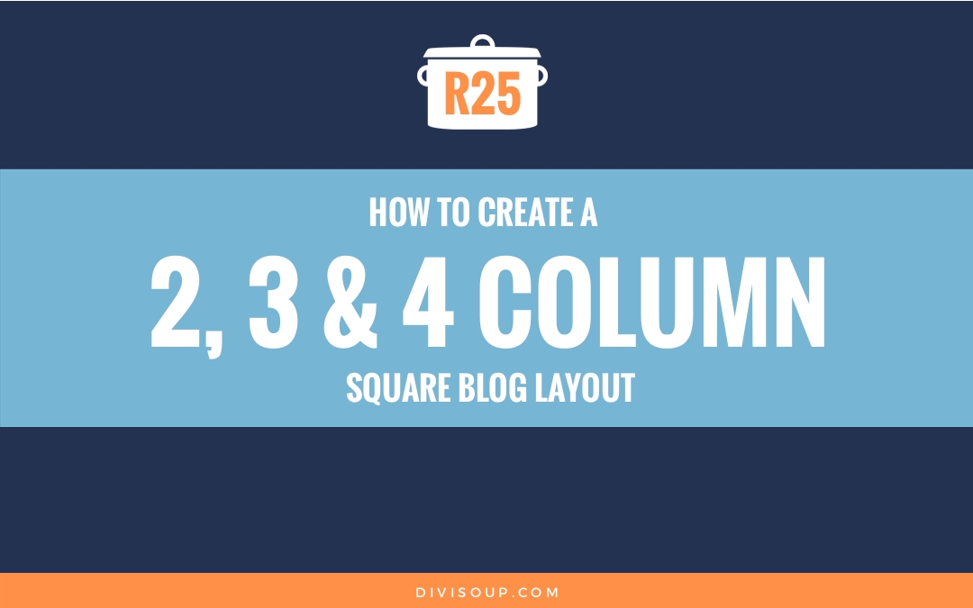
Recipe #25 answers a couple of questions I have been asked recently. How to change the blog grid layout to four columns (I’ve thrown in two columns as well), and how to make the featured image thumbnails square instead of rectangular.
There are a few ways to do this but personally I don’t like messing with PHP unless I have to, I will leave that to far smarter people than me. So this is a totally CSS solution with some cool little snippets you’ll also be able to use elsewhere.
Watch the video, get the code you need in the accompanying blog post, be sure to scroll to the bottom for your fabulous freebie, and let me know what you think in the comments!
So let’s get cooking!
Cooking time
This should take you around 10 minutes max.
Preparation
First let’s set up our section and blog module. On your page, add a new standard section with a single column. In the row settings, make it Fullwidth.

I am going to show you how to create a 2, 3 and 4 column layout but the actual module settings are the same for each version so let’s set that up, add a blog module and apply the following settings:
Layout: Grid
Posts Number: any multiple of the column layout you will be using
Include categories: Which ever ones you want to display
Show featured image: Yes
Read more button: Off
Show author: No
Show date: No
Show categories: No
Show comment count: No
Show pagination: That’s up to you
Featured image overlay: Off
Leave all the other settings alone.


Then Save & Exit
That’s our prep done.
Method
Next we will add some CSS which applies to all three versions of this layout, so whether you choose to create the 2, 3 or 4 column layout, you need to add the CSS from the toggle below into your child theme stylesheet, Divi options custom CSS box or the page specific CSS box.
Global CSS - Needed for all 3 layouts
/*--------------------------------------------------------------------*/
/*-----Two, Three and Four Column Square Blog Layout by Divi Soup-----*/
/*--------------------------------------------------------------------*/

/***Global styles required for all layouts***/

/*This scales the images keeping the aspect ratio. NOTE: Object-fit is not supported in IE and Edge so if you want to use the standard image size remove this section*/
.ds-blog-square a img {
    width: 100%;
    object-fit: cover;
}

/*This section hides the excerpt*/
.ds-blog-square .post-content {
    display: none;
}

/*This section corrects some margin and padding issues*/
.ds-blog-square .et_pb_image_container {
    margin: -19px -19px 0;
}

.ds-blog-square h2 {
    margin: 0;
    padding: 0;
}

/*This section removes the bottom padding from the post and sets the position so we can move the title on top of the image*/
.ds-blog-square .et_pb_post {
    position: relative;
    padding-bottom: 0;
    border: none;
}

/*This section adds the semi transparent overlay and border on the image. It also sets the post title to absolute center*/
.ds-blog-square h2 a {
    position: absolute;
    top: 0;
    left: 0;
    height: 100%;
    width: 100%;
    padding: 40px;
    margin: 0;
    background: rgba(0, 0, 0, .3);
    color: #fff;
    text-align: center;
    outline: 2px solid #fff;
    outline-offset: -20px;
    display: flex !important;
    flex-direction: column;
    justify-content: center;
    -moz-transition: all 0.5s ease;
    -webkit-transition: all 0.5s ease;
    transition: all 0.5s ease;
}

/*This section changes the border and overlay colour and border position on hover*/
.ds-blog-square h2 a:hover {
    background: rgba(255, 255, 255, .5);
    color: #000;
    outline: 2px solid #000;
    outline-offset: 0;
}
Here is what we are doing with this CSS:
This first section sets the width of our image and uses the object-fit property to crop and scale our image so it keeps its aspect ratio when we make it square. Object-fit is not currently support in IE and Edge so if that bothers you or you don’t want square images, you can just leave this section out completely.
.ds-blog-square a img {
    width: 100%;
    object-fit: cover;
}
Next we are hiding the excerpt as this is the only thing we can’t hide in the module settings, and we are also fixing some margin and padding issues.
.ds-blog-square .post-content {
    display: none;
}

.ds-blog-square .et_pb_image_container {
    margin: -19px -19px 0;
}

.ds-blog-square h2 {
    margin: 0;
    padding: 0;
}
This section removes some more padding and the default border and positions the post relatively which will allow us to move the post title on top of the image.
.ds-blog-square .et_pb_post {
    position: relative;
    padding-bottom: 0;
    border: none;
}
And finally, the fun part. Here we are absolutely positioning the post title so it sits on top of the image, then we are giving it a background colour which is our overlay and making that the same size as our image. We are adding an outline and bringing it in from the edge a little to create a border and then using display: flex to center our post title both horizontally and vertically no matter how many words it is.
After that we are adding a little animation on hover to move the outline and change the colour of it, and the text.
I have styled this very simply using just black and white and a thin outline so it is easy for you to change it however you want.
.ds-blog-square h2 a {
    position: absolute;
    top: 0;
    left: 0;
    height: 100%;
    width: 100%;
    padding: 40px;
    margin: 0;
    background: rgba(0, 0, 0, .3);
    color: #fff;
    text-align: center;
    outline: 2px solid #fff;
    outline-offset: -20px;
    display: flex !important;
    flex-direction: column;
    justify-content: center;
    -moz-transition: all 0.5s ease;
    -webkit-transition: all 0.5s ease;
    transition: all 0.5s ease;
}

.ds-blog-square h2 a:hover {
    background: rgba(255, 255, 255, .5);
    color: #000;
    outline: 2px solid #000;
    outline-offset: 0;
}
To make all this CSS apply we need to add a custom class to our blog module, so open up the module settings, click on the Custom CSS tab and in the CSS Class field add a class of ds-blog-square then save & exit.

Now for the individual layout settings.
Four Columns:
Open up the row settings, click on the custom CSS tab and give it a Column CSS class of ds-blog-four-column. Be sure to add this to the Column CSS Class field and NOT the CSS Class field. Then save & exit.

Next, add the CSS from the toggle below into your child theme stylesheet, Divi options custom CSS box or the page specific CSS box.
4 Columns CSS
/***4 Column Styles***/

/*This section changes the layout to 4 columns*/
@media only screen and ( min-width: 981px ) {
.et_pb_column_4_4 .et_pb_blog_grid .et_pb_salvattore_content[data-columns]::before { content: ‘4 .column.size-1of4’ !important;
}
.et_pb_column_4_4 .column.size-1of4 {
width:22.15% !important;
margin-right:1%;
}
.et_pb_column_4_4 .ds-blog-four-column.et_pb_blog_grid[data-columns]::before {
content: “4 .column.size-1of4”;
}
.ds-blog-four-column.et_pb_blog_grid .column.size-1of4 {
margin-right: 3.8%;
padding-bottom: 30%;
width: 22.15%;
}
.et_pb_blog_grid .column.size-1of4:last-child {
margin-right: 0;
}
}

/*This sets the spacing between post rows*/
.ds-blog-four-column .et_pb_post {
    margin-bottom: 25%;
}

/*This section sets the height of the images on different screen sizes to keep it relatively square. If you are not using object-fit because it isn't supported in IE and Edge then you should remove this entire section or the images will be distorted*/
.ds-blog-four-column .ds-blog-square a img {
    height: 33vh !important; /*Adjust this value if you want the images taller or shorter*/
}

@media only screen and (max-width: 1440px) {
    .ds-blog-four-column .ds-blog-square a img {
        height: 28vh !important; /*Adjust this value if you want the images taller or shorter*/
    }
}

@media only screen and (max-width: 1280px) {
    .ds-blog-four-column .ds-blog-square a img {
        height: 25vh !important; /*Adjust this value if you want the images taller or shorter*/
    }
}

@media only screen and (max-width: 768px) {
    .ds-blog-four-column .ds-blog-square a img {
        height: 28vh !important; /*Adjust this value if you want the images taller or shorter*/
    }
}

@media only screen and (max-width: 480px) {
    .ds-blog-four-column .ds-blog-square a img {
        height: 40vh !important; /*Adjust this value if you want the images taller or shorter*/
    }
}
Here is what we are doing:
This section changes the layout from the default 3 columns to 4 columns on screen sizes over 980px wide. Below that screen size the layout will move to 2 columns on tablets and then 1 column on mobiles. We are also removing the margin after every 4th post so our layout has the same margin around every post.
@media only screen and ( min-width: 981px ) {
.et_pb_column_4_4 .et_pb_blog_grid .et_pb_salvattore_content[data-columns]::before { content: ‘4 .column.size-1of4’ !important;
}
.et_pb_column_4_4 .column.size-1of4 {
width:22.15% !important;
margin-right:1%;
}
.et_pb_column_4_4 .ds-blog-four-column.et_pb_blog_grid[data-columns]::before {
content: “4 .column.size-1of4”;
}
.ds-blog-four-column.et_pb_blog_grid .column.size-1of4 {
margin-right: 3.8%;
padding-bottom: 30%;
width: 22.15%;
}
.et_pb_blog_grid .column.size-1of4:last-child {
margin-right: 0;
}
}
Here we are setting the margin between each row of posts so it is relatively even and then also setting a default height for our post images to make them square rather than rectangular. If you are not using the object-fit property which is not supported in IE and Edge as previously mentioned, then you can leave the second part of this section out.
.ds-blog-four-column .et_pb_post {
    margin-bottom: 25%;
}

.ds-blog-four-column .ds-blog-square a img {
    height: 33vh !important;
}
Finally, some media queries to keep our image relatively square on smaller screen sizes. Again if you are not using object-fit you can leave this entire section out. You can also add some more media queries here if you want to cover other screen sizes but this should be enough for most scenarios.
@media only screen and (max-width: 1440px) {
    .ds-blog-four-column .ds-blog-square a img {
        height: 28vh !important;
    }
}

@media only screen and (max-width: 1280px) {
    .ds-blog-four-column .ds-blog-square a img {
        height: 25vh !important;
    }
}

@media only screen and (max-width: 768px) {
    .ds-blog-four-column .ds-blog-square a img {
        height: 28vh !important;
    }
}

@media only screen and (max-width: 480px) {
    .ds-blog-four-column .ds-blog-square a img {
        height: 40vh !important;
    }
}
And that’s it for the four column layout. Want 3 columns? Read on…
Three Columns:
Open up the row settings, click on the custom CSS tab and give it a Column CSS class of ds-blog-three-column. Be sure to add this to the Column CSS Class field and NOT the CSS Class field. Then save & exit.

Next, add the CSS from the toggle below into your child theme stylesheet, Divi options custom CSS box or the page specific CSS box.
3 Columns CSS
/***Three Column Styles***/

/*This sets the spacing between post rows*/
.ds-blog-three-column .et_pb_post {
    margin-bottom: 25%;
}

/*This section sets the height of the images on different screen sizes to keep it relatively square. If you are not using object-fit because it isn't supported in IE and Edge then you should remove this entire section or the images will be distorted*/
.ds-blog-three-column .ds-blog-square a img {
    height: 45vh !important; /*Adjust this value if you want the images taller or shorter*/
}

@media only screen and (max-width: 1440px) {
    .ds-blog-three-column .ds-blog-square a img {
        height: 40vh !important; /*Adjust this value if you want the images taller or shorter*/
    }
}

@media only screen and (max-width: 1280px) {
    .ds-blog-three-column .ds-blog-square a img {
        height: 35vh !important; /*Adjust this value if you want the images taller or shorter*/
    }
}

@media only screen and (max-width: 768px) {
    .ds-blog-three-column .ds-blog-square a img {
        height: 28vh !important; /*Adjust this value if you want the images taller or shorter*/
    }
}

@media only screen and (max-width: 480px) {
    .ds-blog-three-column .ds-blog-square a img {
        height: 40vh !important; /*Adjust this value if you want the images taller or shorter*/
    }
}
Here’s what we are doing:
The default blog grid layout is 3 columns so we don’t need to make any changes there.
Here we are setting the margin between each row of posts so it is relatively even and then also setting a default height for our post images to make them square rather than rectangular. If you are not using the object-fit property which is not supported in IE and Edge as previously mentioned, then you can leave the second part of this section out.
.ds-blog-three-column .et_pb_post {
    margin-bottom: 25%;
}

.ds-blog-three-column .ds-blog-square a img {
    height: 45vh !important;
}
And here we are adding some media queries to keep our image relatively square on smaller screen sizes. Again if you are not using object-fit you can leave this entire section out. You can also add some more media queries here if you want to cover other screen sizes but this should be enough for most scenarios.
@media only screen and (max-width: 1440px) {
    .ds-blog-three-column .ds-blog-square a img {
        height: 40vh !important;
    }
}

@media only screen and (max-width: 1280px) {
    .ds-blog-three-column .ds-blog-square a img {
        height: 35vh !important;
    }
}

@media only screen and (max-width: 768px) {
    .ds-blog-three-column .ds-blog-square a img {
        height: 28vh !important;
    }
}

@media only screen and (max-width: 480px) {
    .ds-blog-three-column .ds-blog-square a img {
        height: 40vh !important;
    }
}
And that’s it for the three column layout. Want 2 columns? Read on…
Two Columns:
Open up the row settings, click on the custom CSS tab and give it a Column CSS class of ds-blog-two-column. Be sure to add this to the Column CSS Class field and NOT the CSS Class field. Then save & exit.

There is one more step with the two column layout. Open up the module settings, click on the Custom CSS tab and right after the class that we added earlier, leave a single space and add another class of ds-blog-square-two then save & exit.

Next, add the CSS from the toggle below into your child theme stylesheet, Divi options custom CSS box or the page specific CSS box.
2 Columns CSS
/***2 Column Styles***/

/*This section changes the layout to 2 columns*/
@media only screen and ( min-width: 981px) {
    /*Two columns*/
    .ds-blog-two-column.et_pb_column_4_4 .et_pb_blog_grid[data-columns]::before {
        content: '2 .column.size-1of2' !important;
    }
    .ds-blog-square-two.et_pb_blog_grid .column {
        width: 47.25% !important;
        margin-right: 5.5%;
    }
    /*This removes the right margin from the last post on each row*/
    .ds-blog-square-two.et_pb_blog_grid .column:nth-child(even) {
        margin-right: 0;
    }
}

/*This sets the spacing between post rows*/
.ds-blog-two-column .et_pb_post {
    margin-bottom: 12%;
}

/*This section sets the height of the images on different screen sizes to keep it relatively square. If you are not using object-fit because it isn't supported in IE and Edge then you should remove this entire section or the images will be distorted*/
.ds-blog-two-column .ds-blog-square a img {
    height: 70vh !important; /*Adjust this value if you want the images taller or shorter*/
}

@media only screen and (max-width: 1440px) {
    .ds-blog-two-column .ds-blog-square a img {
        height: 60vh !important; /*Adjust this value if you want the images taller or shorter*/
    }
}

@media only screen and (max-width: 1280px) {
    .ds-blog-two-column .ds-blog-square a img {
        height: 50vh !important; /*Adjust this value if you want the images taller or shorter*/
    }
}

@media only screen and (max-width: 768px) {
    .ds-blog-two-column .ds-blog-square a img {
        height: 28vh !important; /*Adjust this value if you want the images taller or shorter*/
    }
}

@media only screen and (max-width: 480px) {
    .ds-blog-two-column .ds-blog-square a img {
        height: 42vh !important; /*Adjust this value if you want the images taller or shorter*/
    }
}
Here’s what we are doing:
This section changes the layout from the default 3 columns to 2 columns. We are also removing the margin after every even post so our layout has the same margin around every post.
@media only screen and ( min-width: 981px) {
    .ds-blog-two-column.et_pb_column_4_4 .et_pb_blog_grid[data-columns]::before {
        content: '2 .column.size-1of2' !important;
    }
    .ds-blog-square-two.et_pb_blog_grid .column {
        width: 47.25% !important;
        margin-right: 5.5%;
    }
    .ds-blog-square-two.et_pb_blog_grid .column:nth-child(even) {
        margin-right: 0;
    }
}
Here we are setting the margin between each row of posts so it is relatively even and then also setting a default height for our post images to make them square rather than rectangular. If you are not using the object-fit property which is not supported in IE and Edge as previously mentioned, then you can leave the second part of this section out.
.ds-blog-two-column .et_pb_post {
    margin-bottom: 12%;
}

.ds-blog-two-column .ds-blog-square a img {
    height: 70vh !important;
}
Lastly, some media queries to keep our image relatively square on smaller screen sizes. Again if you are not using object-fit you can leave this entire section out. You can also add some more media queries here if you want to cover other screen sizes but this should be enough for most scenarios.
@media only screen and (max-width: 1440px) {
    .ds-blog-two-column .ds-blog-square a img {
        height: 60vh !important;
    }
}

@media only screen and (max-width: 1280px) {
    .ds-blog-two-column .ds-blog-square a img {
        height: 50vh !important;
    }
}

@media only screen and (max-width: 768px) {
    .ds-blog-two-column .ds-blog-square a img {
        height: 28vh !important;
    }
}

@media only screen and (max-width: 480px) {
    .ds-blog-two-column .ds-blog-square a img {
        height: 42vh !important;
    }
}
For each version of this layout you will probably want to go into the advanced settings tab of the module and adjust the header font size for desktop, tablet and mobile depending on which font you are using.
And that’s it. Now you should have a lovely 2, 3 or 4 columns layout just like my demo.
If you found this helpful please leave a comment and subscribe to my newsletter for all my latest Divi related content. 
Michelle X


Hi Michelle.. I tried everything.. even used the json file but im not getting 4 column layout.. not sure why..
Replace the CSS for the 4 column layout with the following:
@media only screen and ( min-width: 981px ) {
.et_pb_column_4_4 .et_pb_blog_grid .et_pb_salvattore_content[data-columns]::before { content: ‘4 .column.size-1of4’ !important;
}
.et_pb_column_4_4 .column.size-1of4 {
width:22.15% !important;
margin-right:1%;
}
.et_pb_column_4_4 .ds-blog-four-column.et_pb_blog_grid[data-columns]::before {
content: “4 .column.size-1of4”;
}
.ds-blog-four-column.et_pb_blog_grid .column.size-1of4 {
margin-right: 3.8%;
padding-bottom: 30%;
width: 22.15%;
}
.et_pb_blog_grid .column.size-1of4:last-child {
margin-right: 0;
}
}
Hey Shay, are you sure there’s not something missing in the second line of this code? The 4 columns are still not working for me and I get Expected RBRACE on that line. Thx
No, that is a false error and happens often when linting CSS with media queries
Hi. Four column not work? Maybe it new update Divi theme?
Your demo four column not work too https://playground.divisoup.com/2-3-and-4-column-square-blog-layout/
Replace the CSS for the 4 column layout with the following:
@media only screen and ( min-width: 981px ) {
.et_pb_column_4_4 .et_pb_blog_grid .et_pb_salvattore_content[data-columns]::before { content: ‘4 .column.size-1of4’ !important;
}
.et_pb_column_4_4 .column.size-1of4 {
width:22.15% !important;
margin-right:1%;
}
.et_pb_column_4_4 .ds-blog-four-column.et_pb_blog_grid[data-columns]::before {
content: “4 .column.size-1of4”;
}
.ds-blog-four-column.et_pb_blog_grid .column.size-1of4 {
margin-right: 3.8%;
padding-bottom: 30%;
width: 22.15%;
}
.et_pb_blog_grid .column.size-1of4:last-child {
margin-right: 0;
}
}
Hi, Michelle,
Thank you for this wonderful tutorial! Now my blog looks much cooler!
However I tried to use images without semi-transparent overlay, but it makes titles hardly readable. Could you please suggest a way to make background rectangles to the titles, like here: http://remarques.com/
Not really with this recipe as the text link is used to create the hover effect and makes the whole area clickable, so changing that to be a box just behind the text changes the whole effect
Ok. i see. Thanks anyway!
Hi, Michelle,
First of all, thank you very much for your help and this wonderful web. You really helped me to fixed some problems on my future website.
I tried the 2 column css and it worked, but the images doesn’t show in HD in the main page. Here it is: http://www.proyectowakaya.com
Do you know how could the images resize to fit the format I give them? (Even if they’re not squared)
Thank you very much for your time!
There are some solutions here you might ant to take a look at http://www.eleganttweaks.com/divi/changing-portfolio-blog-module-thumbnail-sizes/
Hi again, Michelle,
I noticed my blog page is also doing something strange with the way it organizes posts. I don’t know what method it’s using, but it’s not organizing my posts by date since I put in the 2-column code. Also still having that issue with some rows showing two columns and others showing only one column on the left side. Any ideas?
This is a bit outdated now after all the recent Divi updates. I am working through some of my more popular recipes and updating them gradually with new and better code so I will have to say please wait until this is updated as anything tweaked now won’t work well going forward.
Hi,
I have the same problem, is there not solution yet?
As I mentioned, this method is very outdated so I would suggest folling this tutorial instead https://divisoup.com/how-to-use-css-grid-with-divis-feed-modules/
You can still use the styling from this tutorial for the actual posts but for the columns use the new tutorial
Hi Michelle, This is the first time I’ve come across your site, and it’s been very helpful. I’ve been in tears over trying to get my blog into a 2-column style. A couple things, though: 1) Like a previous commenter, I also have my first four rows showing only one post. Row 5 and below shows two posts side by side. I have “Static CSS File Generation” and “Minify and Combine CSS Files” disabled in Theme Options. 2) I was wondering how to make my excerpt be on top of the featured image with the title. I actually want to… Read more »
Mariam please take a look at this recipe, its a much easier and more future proof way of adjusting your columns: https://divisoup.com/how-to-use-css-grid-with-divis-feed-modules/
For your element order, you can add some JS to Divi Them Options like this:
Hi Michelle,
THANK YOU! I’ve been agonizing over the columns for so long, and the CSS Grid how-to worked perfectly. I even figured out how to update the CSS to keep the hover effect I so wanted from this tutorial. The only things I’m trying to figure out now are how to make all my featured images square and how to make my title text change color on the hover. Thanks for being such a great resource!
Most welcome Mariam and well done
Hi Michelle,
great article you wrote!!
But I have another question. I want to use a 3 col blog grid and on the right side a sidebar.
Now my problem is, that if I let all setings standard, I only see a 2 col grid. Your 4 col CSS trick work good for me but not the 3 col way :-((
I try Standard 3/4 1/4 element and the Specialy Section (number 4 if I start count top left to count).
Could you tell me what I have to do?
Best regards
Felix
Please check out this recipe, its much more up to date CSS and you can have any columns you want https://divisoup.com/how-to-use-css-grid-with-divis-feed-modules/
Hi Michelle
I was very happily using the 4 column code (Theme Options, Custom CSS / latest version of WP and Divi) on two pages of a client site, but suddenly I notice that all modules are one-column wide, one on top of the other with large spaces in between. I wondered if this is what Josep is referring to below so added the CSS inside style tags in a code module on the page but that hasn’t helped. Does the entire CSS go in there unadulterated, or is there anything I should be adding/removing to the code?
Michelle, please ignore my message; I disabled static CSS and minification and it’s all come back, looking as good as ever. I don’t know why that stuff is on as default! x
x
That’s great Sarah, and I completely agree, they should be off by default!
Any idea why my first row only shows one blog post, but my second row shows 2 posts? I have selected only one “category” to display for this client, but when I preview and add in other fields, some will show up as 1 per row, and some will double up in the two-per-row…
I couldn’t say without a link Alex but also make sure you have static CSS and minification disabled in Divi theme options
Thanks for a great tutorial! I wonder if it’s possible to remove the dark overlay so the images look normal when you don’t hover over them?
Yes, just remove the background colour property from this section of the CSS .ds-blog-square h2 a { position: absolute; top: 0; left: 0; height: 100%; width: 100%; padding: 40px; margin: 0; background: rgba(0, 0, 0, .3); color: #fff; text-align: center; outline: 2px solid #fff; outline-offset: -20px; display: flex !important; flex-direction: column; justify-content: center; -moz-transition: all 0.5s ease; -webkit-transition: all 0.5s ease; transition: all 0.5s ease; }
Hey Michelle, thanks so much for this.
For some reason, my images are blown out. I’ve got the 100% width and the 45vh but I can’t figure out what’s wrong.
Also, I didn’t want the titles at all. What’s the code to hide them? I just want the feature image with the basic hover. Thanks
Link: https://carolynwitt.com/calm-confidence-blog/
Did you get your title issue resolved Carolyn? You just need to set the h2 element of the post to display: none
Hello Michelle!
Great work writing this tutorial. We succesfull made the change, but in one of the last updates of DIVI, actually we have version 3.0.65, the 4 columns tweek stopped working. Any suggestion for update the code?
Thank you very much!!!!
Where have you added the CSS Josep? I see this also happened in my demo so moving it inside style tags in a code module fixes the issue. I have not tried it in the stylesheet yet.
Thank you very much Michele!, we was added the CSS style to the page specific Custom CSS box of DIVI Builder Settings.
Now we add a new CODE module and we paste the CSS and now works.
That’s great
Hello, I’m not so familiar with these code modules. I inserted code module below blogmodule and inserted 4 columns css code there but nothing happened. Where and how this code actually should be inserted?
I am not sure why you are using a code module, the tutorial does not call for one?
Hello,
Currently with the latest version of Divi 3.0.64 there is no field for Column CSS in the Row settings, it’s for column 1 & 2.
I want to ask you. Is it possible to create 4 blog posts on the row if the row contains 3/4 (blog) 1/4 (sidebar) ?
Something like this:
blog blog blog blog sidebar
blog blog blog blog
blog blog blog blog
Thanks in advance.
Best Regards,
Alex
Yes it is, this is on my list to write about as its a fairly common question.
Hello, Thank you very much for this. I am having a very difficult time with the columns changing as they should in tablet and phone view. I have checked the code and tried to tweak it many times and it still keeps four rows no matter what view I am in. And when i go to tablet or phone view it squishes the images terribly and if I keep the excerpt it elongates that as well. I am new to website building and could use some help on this. Thanks!
Would need to see a link to determine the problem
Hello – I am wondering if there would be a nice way to show the excerpt upon hover? I love having the look, but am wanting an ability to nicely see an overview. The problem, I find, is sometimes too little information is given and I am trying to strike a balance.
Yes. You would need to alter the CSS to position the excerpt absolutely, have the opacity set to zero and then change that to 1 on hover. You will also need to change the title to opacity 0 on hover.
I don’t know if you easily know off hand where those code changes need to be made… but I am having a hard time. I have figured out how to hide the title on hover, but not display the excerpt on hover.
You would need to replace the excerpt being hidden in the CSS:
.ds-blog-square .post-content {
display: none;
}
With this
.ds-blog-square .post-content {
opacity: 0;
}
.ds-blog-square .et_pb_post:hover > .post-content {
opacity: 1;
}
Hi
This helped me to get understand the blocks and layout on 4 column but i am looking to achieve http://www.ivygate.co.uk 4 column image blocks on homepage.
Can you please help me to findout how i can achieve this? Does this required any CSS or is it simple and built in option within theme. I have tried all modules but nothing is forming up with static text and overlay style in 4 columns. Please advise.
Thanks and best regards
Adam
You can use button modules with images in the column backgrounds. Use CSS to set a min-height for the button and change the background colour on hover in the divi settings
Thank you so much! Great work
Helped me a lot with fixing my problem.
Have an awesome day!
You’re welcome Natha
Could you please explain what these lines of code are doing?
.ds-blog-two-column.et_pb_column_4_4 .et_pb_blog_grid[data-columns]::before {
content: ‘2 .column.size-1of2’ !important;
}
Thanks!
That is changing the number of columns in that section from 4 to 2
hey my excerpt is still showing
There must be an error in your code somewhere, can you provide a link
Thank you for this tutorial. I love the idea of this. But something is going awry for me. I am certain you’re busy, but could you tell me if you see what has happened? The layout is working, and the overlay looks wonderful, but there is zero margin between any of my posts whatsoever, and even though the featured image is a square, it’s spreading to the full size of the page, making it a sea of image and no negative space. Here’s the link: http://847.0d7.myftpupload.com/q-a-blog/
I guess you got this fixed Nathaniel because its looking great
This was a great tutorial. Thank you for your help. I was wondering if there was any way to make the font size of the title smaller in the mobile view. My titles are overlapping the lines as you can see in http://inspireintoaction.com/
You can set the font size for mobile and tablet within the advanced settings of the blog module Tara
Thanks for this – I am particularly looking for a way to duplicate what you did with your three columns on the Home page without space between them and CTA on them as well. I thought CTA Module would do it, but it doesn’t work…
Those are CTA modules. Ensure you have the row set set fullwidth and gutters set to 1 in the row settings
Hi Michelle,
great tutorial and really clear – I’m going to have a go at implementing it now!
This may be slightly off-topic but I wondered if you knew of a way of enabling some posts on the blog page to spread horizontally over two columns?
I’m thinking of something like the independent.co.uk website where they’re presumably categorising their posts in a particular way to determine size and shape.
I think I can cope with post height within the columns but I’m struggling to think of a way to get the posts to ‘break out’ of the columns
with thanks
Jem
Take a look at this tutorial from Geno Quiroz which may help https://quiroz.co/building-a-magazine-layout-with-divi/
Hi Michelle, I discovered your website recently while looking how to modify a bit the blog module as I find the customisation settings quite poor. I would like to achieve what you show + a sidebar. So 3 columns + sidebar. I saw that somebody already asked about it but I don’t seem to make it work because in your example the 3 columns in the default layout but with a sidebar then the 2 columns is the default layout. So I tried to do it by modifying the code you give for the 4 columns but it doesn’t work.… Read more »
Do you have a link Laura?
Hello Laura!
I have the same problem. Have you found a solution?
Thanks!
same problem for me . please HELP !
Please add the following to Divi >Theme Options < Custom CSS: @media only screen and ( min-width: 981px ) { .et_pb_blog_grid .et_pb_salvattore_content[data-columns]::before { content: ‘4 .column.size-1of4’ !important; } .et_pb_column .column.size-1of4 { width:23% !important; margin-right:2%; } }
Need some help and stuck on how to solve this. I have a podcast site that I built with Divi. I’m not a web designer, I just do the point and click stuff so my site looks very flat. Now and then I pick up a little css code and paste it in, but I have no idea how all that works, that’s why i got Divi in the first place…so I could build something quickly, without coding. However, the current dilemma, and where I would love some copy and paste help wherever possible is this… Whenever I interview a… Read more »
You can set an absolute image size for them like…
height: 200px;
width: 200px;
And then use…
object-fit: cover;
So they scale. But the issue you have is that the focal point of your images are a different position for each so sometimes the person may be in the middle of the square and sometimes cut off. It would be best practice to get some uniformity to your images. You can also try using a free image editing service like https://www.picmonkey.com/ which also you to visually crop images in just a few seconds.
This has been a helpful tutorial and I appreciate the amount of detail you’ve given explaining all the CSS, but despite my best efforts in tweaking the code to my layout, I’m having a little trouble. You use the object-fit property to modify the featured image into a square, but how could we change that to a 1:2 ratio crop of the feature image?
Chris I am not entirely clear what you are trying to achieve but this may help http://stackoverflow.com/questions/12991351/css-force-image-resize-and-keep-aspect-ratio
Thank you very much for the work on this! I’m using the two column blog layout. Very Nice.
Thanks Kelly, glad you like it!
This is great. Is there a way to get 3 columns with a sidebar?
Yes, you can just reduce the % for the width of the 3 columns to accommodate a sidebar
Hello Michelle!
Thanks a lot for your great tips! I’m struggling with this problem. I would also like to have a blog layout with 3 columns and the sidebar on the left. I would like to keep the read more button, the excerpt, author and comments. I haven’t managed to make it work. Do you know how it can be done? Thanks in advance for your help!
I will look to draft some CSS for this, keep an eye out around Facebook
Great tutorial Michelle!
Can you give me a hint on how to adjust the css so it will show the image in square and the title, date and category centered underneath?
I would appreciate your help. Thanks!
A link will help but off the top of my head this should get your text centered:
.yourmoduleclass .post-meta {
text-align: ceter;
}
For the square images, check out some of my other blog module recipes, a few of them have instructions for changing the image sizes.
Great job Michelle, how about if i want it to be 5 rather than 4 what i have to do! thanks.
You will want to adjust the width, margin and nth-child. So here for example, decide how much margin you want in between posts, then times that by 4, deduct that result from 100 and then divide that by 5. Enter the values in the first section below and change 4n to 5n in the following section. I have a tutorial coming soon on any number of columns for the filterable portfolio module and it comes with a handy google sheet calculator too .ds-blog-four-column.et_pb_column_4_4 .column.size-1of4 { width: 20.875% !important; margin-right: 5.5%; } .ds-blog-four-column.et_pb_column_4_4 .column.size-1of4:nth-child(4n) { margin-right: 0; }
Thanks a lot, looking froward for your coming tutorial. Wish you luck.
Hi Michelle,
I would like to add this to the 2nd column of the row. When I tried it in one column row it worked fine.
But when I added it on the 2 column row and put it on the 2nd row it didn’t work.
Do I have to change anything?
Sorry, I got it now. How can I remove the spaces between post? Thank you.
Hi,
@Michelle : Thanks a lot for this tuto !
@Ozelle : How did you manage to have it work on the 2nd column of the row (I search but can’t seem to find a solution to apply the 3 columns style, always end up with two) ?
Thank you
Yes most likely, the CSS applies to a certain class and that will change if you add more columns, provide a link and I will see if I can help
Thank you so much for this! Since I am a Divi Newbie, I was wondering, if and how I can do this style to a single picture, with a backlink. I want to display some things, other than my Blogposts, with this style and would like to display my Blogposts in another way!
Thank you so much.
Corinna
Corinna have you looked at the Gallery and Portfolio modules? That’s what you want to use for non-blog post content
I got it all to work but one thing …
I like to use 4 col and I got it all to work BUT i also like to have a separate background for each col such as col 1 is red, col 2 is blue, col 3 is green and col 4 is teal [just examples] Since im not an css expert I would like to know if there is a simple way to do this?
Yes not too difficult. Add this CSS to what you have already and change the colours as needed. You will also need to add media queries to decide the column colours when stacking in 2 and 1 columns:
.ds-blog-four-column.et_pb_column_4_4 .column.size-1of4:nth-child(1n) {
background: red;
}
.ds-blog-four-column.et_pb_column_4_4 .column.size-1of4:nth-child(2n) {
background: blue;
}
.ds-blog-four-column.et_pb_column_4_4 .column.size-1of4:nth-child(3n) {
background: green;
}
.ds-blog-four-column.et_pb_column_4_4 .column.size-1of4:nth-child(4n) {
background: purple;
}
Thank you. I found your site and I will be coming back often. Keep up the good work!!!
You are most welcome
As always, beautiful! Thanks Michelle.
Thank you Maureen