Like our free content? Then you'll love our exclusive Club!
Divi Academy Membership gives you exclusive access to over 110 resources, including child themes, layouts, cheatsheets, tutorials, live training and member perks. And new content is added EVERY Monday!
As is the case with most of my tutorials, today’s recipe is the result of questions from the Divi Facebook Community. I am going to show you how to display two menus at the same time, one with the default menu style and one with a hamburger icon, using either of the slide-in or fullscreen header options.
This question has been asked many times, but I have yet to see a good solution without using a plugin or extensive unnecessary code, so I thought I would create one. I call it the ‘Divi Double Menu’ 
You would perhaps think you could achieve this effect using the secondary menu position for one of your menus. Unfortunately not so, as Divi merges both the primary and secondary menus into one when using either the slide-in or fullscreen header options.
The beauty of this solution is that it utilises everything already built into Divi so it’s super easy to edit, and the additional code is very minimal too.
So let’s get cooking!
Ingredients
The latest version of the Divi Theme from Elegant Themes.
An active child theme – we are going to be adding a header.php file (or editing it if you already have one) so a child theme is imperative if you don’t want the effect overwritten when you update Divi.
Cooking time
This should take around 30 minutes.
Preparation
For the prep we going to set up our header layout in the customiser.
Navigate to Divi > Theme Options > Customiser. Once there, click on Header & Navigation > Header Format and select either the Slide In or Fullscreen option. I am using the Slide In but this recipe will work for both without any changes needed. Be sure to hit Publish to save your changes.

Now you can select what you want to display in the Header Elements section. For the purposes of this recipe I selected to display the search field and social icons but I have left pretty much everything else at their defaults, only reducing the Logo Max Height value. I suggest you leave everything at their defaults also until you have this set up, then once it is working you can go back into the customiser and start tweaking.
Ok, that’s our prep done. Time for the method.
Method
We’ll start by setting up our menus. We will need two, one with all our links and one with the links we only want to show in the default style menu.
So head over to Appearance > Menus and create a new menu. Give the menu a name, I am calling mine ‘Main menu’. This is the menu we are going to display in the default style next to the logo.
Add your menu items as you usually would but DO NOT select a menu location, we are going to be using this menu in a fullwidth menu module. Be sure to Save your menu.
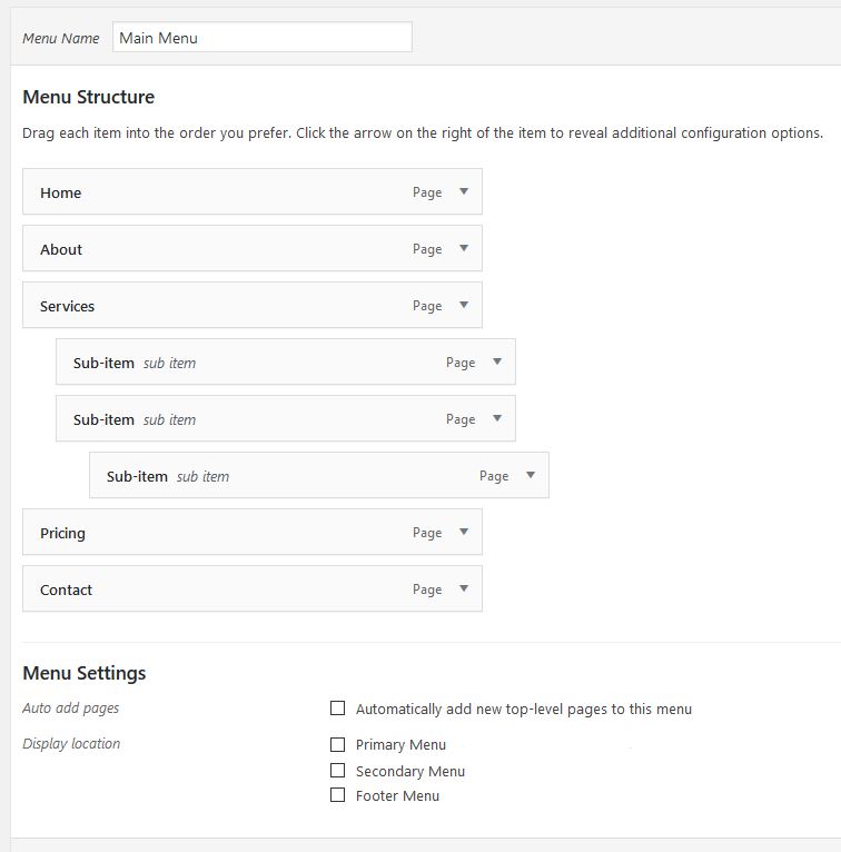
Now create a second menu and give it a name, I am calling mine ‘Slide In Menu’. With this menu, you first want to duplicate the menu you just created, add all the items you added to the previous menu first, and then below that add the items you only want to show in the slide in or fullscreen menu. Then select Primary Menu under Menu Settings > Display Location and hit Save Menu.

The reason we duplicated our first menu is because, when viewed on tablets and mobiles all menus, including the fullwidth menu module, will switch to the hamburger icon, and showing two hamburger icons is going to confuse your users. So we want two menus on desktop, but a single menu on tablets and mobiles.
To achieve this, we are going to add a custom CSS class to the duplicated menu items in our second menu so we can hide them with CSS a little later in this recipe.
Expand each of the duplicated items in the second menu and add the class ds-hide-menu in the CSS Classes (optional) field. If you have any sub menu items you don’t need to bother adding the CSS class to these (but it won’t hurt), the sub items will be hidden if the parent item has the class.

If you don’t see the CSS Classes field, scroll to the top of the page and click on Screen Options in the right hand corner, click the CSS Classes checkbox and the field will then show under your menu items.

Once you have added the class ds-hide-menu to all of the menu items you duplicated from the first menu, hit Save Menu again.
Now we need to set up our fullwidth menu module. We are going to do this with a library layout so we can then add it to our child theme but still have it editable from within Divi.
Navigate to Divi > Divi Library and click Add New.
Give your layout a name, I am calling mine ‘Main Menu‘ as that is what I called the menu I created to be used with this module. Set the Layout Type to Fullwidth Section and make it Global. It doesn’t have to be global as we are not likely to use it anywhere else on our site but it doesn’t hurt to do this. Then hit Submit Query. (Has it always said Submit Query? I never noticed before but that is strange wording  )
)

Click on the Section Settings icon and then in the Advanced tab give the section a CSS Class of ds-main-menu

Then scroll to the bottom and Disable the section on Phone and Tablet.

Next, click on the Design tab and in the Spacing section add a right margin of 50px and a left margin of 15% , then Save & Exit.

Now, in your section, click on Insert Module (s) and select the Fullwidth Menu module.

Select the first menu we created (Main Menu) in the dropdown.

Now go to the Design tab and set Make Menu Links Fullwidth to Yes and make sure the Text Orientation is set to Left.

You can now change any of the other styling you want but I would suggest going back to do this once everything is set up and working.
Finally, hit Update on the page to publish your layout. Then look up at the the URL in your browser’s address bar and make a note of the layout ID# (we are going to need it in the next step). It will be the number you see after wp-admin/post.php?post=, shown here as 123, but the number could be anything from two to 6 digits or more depending on the size of your site.
Next, we are going to add this new layout to our child theme. If you don’t already have a header.php file in your child theme, you need to download the latest version of Divi and unzip it. Then in the root Divi folder, copy the header.php file and paste it into the root folder of your child theme.

Once you have the header.php file in your child theme, go ahead and open it in your favourite code or plain text editor.
We are going to insert our fullwidth menu layout into the header using a php echo. Depending on which version of Divi you are using (this recipe was created using version 3.0.105), your header.php file may look a little different. So run a search for ‘logo_container‘, there will only be once instance of it and the code should look something like this:

Directly underneath this, we need to add the echo to display our menu layout. I can’t post the code here or it messes with my layout so click here to download a zip file containing the required php echo in a text file. Copy and paste the code directly below the closing div shown in the image above.
Change the 123 in the code you download to the ID# of the layout that we made a note of earlier. When you are done, this section of code should look something like this, you can see the php echo between the logo and the menu:

Now save your header.php file and upload it to the root of your child theme either via FTP or cPanel. We are almost done.
The last step is to add our CSS, here is what we are doing:
Firstly we position our menu section absolutely, so it doesn’t knock the logo and slide in menu out of place.
Then we add a transition to the section, menu, and menu when fixed navigation is active. This is so our menu appears to gradually shrink with the rest of the header when the user scrolls.
.ds-main-menu {
    position: absolute;
}

.ds-main-menu,
.ds-main-menu .et_pb_fullwidth_menu .fullwidth-menu-nav > ul,
.et-fixed-header .ds-main-menu .et_pb_fullwidth_menu .fullwidth-menu-nav > ul {
    -webkit-transition: all .4s ease-in-out;
    transition: all .4s ease-in-out;
}
Next we are adjusting the padding of the menu items when the fixed navigation is active. If you change the height of the header in the customiser, you will need to adjust these padding values a little so your menu sits at the vertical center and doesn’t overflow the header area.
Then we adjust the left margin. We set the left margin at 15% in the section settings earlier but that applies to the header when fixed navigation is not active. By default, when you scroll your logo will shrink slightly, and we want the menu to move to the left as the logo shrinks, so here we have reduced the margin to 10% when fixed navigation is active. You may need to adjust both the 15% in the section settings and the 10% here depending on the width of your logo.
.et-fixed-header .ds-main-menu .et_pb_fullwidth_menu .fullwidth-menu li > a {
    padding-bottom: 15px !important;
}

.et-fixed-header .ds-main-menu .et_pb_fullwidth_menu .fullwidth-menu-nav > ul {
    padding: 15px 0 0 !important;
}

.et-fixed-header .ds-main-menu {
    margin-left: 10% !important;
}
And finally a media query. All we are doing here is hiding the duplicate menu items in our slide in/fullscreen menu on desktop.
@media all and (min-width: 981px) {
    .ds-hide-menu {
        display: none;
    }
}
Copy the complete CSS with comments from the toggle below and paste into your child them stylesheet, save and upload it and you’re done.
Complete CSS
/*-----------------------------------------------*/
/*---------Divi Double Menu by Divi Soup---------*/
/*-----------------------------------------------*/


/*Position the default styled menu*/

.ds-main-menu {
    position: absolute;
}


/*Add transition effect to the default style menu*/

.ds-main-menu,
.ds-main-menu .et_pb_fullwidth_menu .fullwidth-menu-nav > ul,
.et-fixed-header .ds-main-menu .et_pb_fullwidth_menu .fullwidth-menu-nav > ul {
    -webkit-transition: all .4s ease-in-out;
    transition: all .4s ease-in-out;
}


/*Reduce menu item padding on fixed header*/

.et-fixed-header .ds-main-menu .et_pb_fullwidth_menu .fullwidth-menu li > a {
    padding-bottom: 15px !important;
}

.et-fixed-header .ds-main-menu .et_pb_fullwidth_menu .fullwidth-menu-nav > ul {
    padding: 15px 0 0 !important;
}


/*Move menu to left when header fixed*/

.et-fixed-header .ds-main-menu {
    margin-left: 10% !important;
}


/*Hide items from slide in menu on desktop*/

@media all and (min-width: 981px) {
    .ds-hide-menu {
        display: none;
    }
}

/*-----------------------------------------------*/
/*-------End Divi Double Menu by Divi Soup-------*/
/*-----------------------------------------------*/
And that’s it. Now you can display two seperate menus without using a plugin or tons of code!
If you found this helpful please leave a comment and subscribe to my newsletter for all my latest Divi related content. 
Michelle X


I followed instruction exactly but it seems that the menu loads on top of the logo then moves to the correct place. How do I make it just load into the correct position instead of moving after some of the page has loaded?
You can remove this section of code in the CSS:
/*Add transition effect to the default style menu*/
.ds-main-menu,
.ds-main-menu .et_pb_fullwidth_menu .fullwidth-menu-nav > ul,
.et-fixed-header .ds-main-menu .et_pb_fullwidth_menu .fullwidth-menu-nav > ul {
-webkit-transition: all .4s ease-in-out;
transition: all .4s ease-in-out;
}
Great tutorial though I am having a couple issues. The @media query either does not work or is being overwritten by the divi default and we had an issue on custom post types. Using Events Calendar Pro by Modern Tribe it appears that the menu is placed inside a new div call et-boc. I fixed this by specifically giving that div a 0px height but also having issues with a white background again. Really help on the @media would complete this headache I’ve been having for 3 days. site is panorama-consulting.com
Hello, thanks for the great tutorial. Just wondering if it is possible for the menu to sit to the right-hand side next to hamburger icon?
I have changed the right margin to a higher % (77%) which sort of works but it doesn’t reposition if the screen size changes.
Is this possible?
Many thanks!!
Looks like you got this sorted?
Hi, is there a way to move the menu from a left-justified position (near the logo) to a right-justified position (near the hamburger menu). I’ve set the module to justify on my site but its still in left alignment. https://pl.mystudioengine.net/
Just increase the left margin for the SECTION with the menu. It’s at 10% right now, but try changing it to 16%.
Will do. Thanks!
BTW, I have another issue and I hope you can help me find where its coming from. This one only shows when on mobile, when jumping to a different page. The hamburger menu icon jumps to the left and going back to the right.
Here’s an image
From my end that looks like maybe a transition. I don’t see sliding, but there is fade delay. Look for the transition:none properties in the CSS and try adding an !important rule to see if that helps.
Just thinking here, could I do half of this tutorial with the Divi Layout Injector (the header.php part) and still follow the rest of the tutorial?
Haven’t tried that, but it should work OK
Hi, Thank you for this tutorial. This is exactly what I was looking for however I have a slight issue with my default navigation as it adds some unnecessary styling to this element:
“et_pb_module et_pb_fullwidth_menu et_pb_fullwidth_menu_0 et_pb_bg_layout_light et_pb_text_align_left et_dropdown_animation_fade et_pb_fullwidth_menu_fullwidth”
More specifically, margin-top: 80px; and white background. How do I get rid of this so that my navigation is inline with the logo and a hamburger button. I’ve noticed on your demo page that your example doesn’t have this, have I done something wrong?
You can adjust those settings in the menu module itself
Good day to all. I can not apply this chip – there is a white screen at the top of the page, there are problems with the logo. Can anyone help?
We need to know the steps you have taken to achieve this and live link to try to determine the problem
This tutorial is going to be so useful for those of us just creating our websites. Following your advice will definitely help owners run a smart business. As someone who’s not familiar with a ton of code, thanks so much!
Glad it helps! We saw quite a few requests for this one for sure!
Dear Michelle, thanks for sharing this information!
Can I ask you a question? My header settings are Centered Inline Logo. I would like to stay it that way. Is there a way to create a double menu with this type of header?
Thanks already!
Not with this tutorial since we are utilizing the menu module.
Hi Michelle, What I’ve recently wondered (and asked ET Support but they’ve said it’s not yet possible) is about being to have the hamburger menu appear initially – and then be replaced by one of the linear menus on scroll. The reason being is to have a more ‘clean’ view initially but still with navigation available. The site I wanted to do it on is one I created recently, which is more than a little bit influenced by your Pinnacle child theme in Divi Layouts – https://gravitascontracts.com Not sure if it is possible and has Divi Soup recipe potential for… Read more »
Sounds pretty unorthodox, so not likely something we would do a recipe for. However, you can easily create elements, say a new menu, to display on scroll or at after a certain amount of time. You may want to search for something along those lines instead of something this specific.
Whilst I agree with Shay on this, it does spark my interest when someone says something can’t be done in Divi
So here you go Alan, this utilises the fixed navigation class so you need to make sure that is on in Divi theme options:
@media all and (min-width: 981px) {
#top-menu-nav,
.et-fixed-header #et_mobile_nav_menu {
display: none;
}
#et_mobile_nav_menu,
.et-fixed-header #top-menu-nav {
display: block;
}
}
That’s brilliant, many thanks Michelle – I’ll give it a try and let you know . Have a great week
Congratulations, great job!
Just a small aesthetic detail, I would like the hamburger menu to appear without moving the contents of the window.
Thank you Michelle
This is default Divi behaviour but I have a post here that moves the slide in to the left https://divisoup.com/move-divi-slide-menu-left/ You will see in the CSS the relevant classes for the placement of the main header and page container when the menu is open, you just need to change that so it would be something like: .et_pb_slide_menu_active header#main-header, .et_pb_slide_menu_active #page-container { left: 0 !important; } You will also need to move the close ‘x’ icon as this is attached to the main header and will therefore be underneath the slide in when it is open. I would suggest playing with… Read more »
Ok, super Michelle,
I will test on occasion.
Thank you very much.
That’s really great!
I hadn’t thought of doing this before but your simple recipe makes it a doddle!
You’ve given me inspiration to try this out on a new project.
Thank you so much for your efforts.
Most welcome Hurri, let us know if it works out for you
Michelle! I am so happy with this amazing tutorial! I have no proper words to thank you enough. Thank you so much! It will help me move a big step ahead not only with the menus, but with custom dynamic layouts as well.
That’s awesome Elisandro, thank you and best of luck with it